Showing posts with label SpaRitual. Show all posts

Tuesday, April 10, 2012

"Kate Spade" manicure - SpaRitual Driftwood & OPI Glitzerland

I got a new wallet for my birthday - after 10 years! finally! - and I think it's fair to say that I'm a little obsessed with it. (In case you're curious, it's this one by Kate Spade in flo coral.) The lining of it inspired me to do another dot manicure (see my other dot mani here), and since the pattern is classic Kate Spade, I'm anointing this the "Kate Spade manicure" - hope she doesn't mind...


And a peek inside my wallet...


I used SpaRitual Driftwood and OPI Glitzerland for the dots.

Nail art is clearly not my forte, but the dots are easy enough to do with the end of a bobby pin, and I think it turned out pretty cute!

Have you dabbled in any nail art lately?

kittytokaren


Tuesday, November 29, 2011

Golden Toes!

It's that time again...to show you what's on my feet! (Without showing you my feet...)

They look kind of crazy on my hands (read: yellow and icky) but on my toes they are golden and glorious!

Index & middle: Orly Glitz & Glamour
Ring & pinky: SpaRitual Reflection


Gold is by far my favourite colour for my toes (closely followed by navy). In winter especially, I love removing my socks and boots to find sparkly gold tootsies! It's a little surprise for me at the end of the day.

What is your favourite colour for toes?

kittytokaren


Wednesday, November 9, 2011

The Beach in Fall - SpaRitual Driftwood

Maybe it's just the name, but this colour makes me think of fall - even though it's pale. Looking at it reminds me of those few precious weeks between the end beach season and the beginning of winter. Growing up in Holland this was a really serene time. Tourists would be long gone, and we would all go down to the beach and eat giant bowls of mussels by the sea. I love how the North Sea smells and how the beach feels in this season - especially when it feels like you have it all to yourself.

SpaRitual Driftwood...


A really lovely pale cream colour. Neutral, but not too girly. Soft, but not stark. Will definitely be a staple for me.

kittytokaren


Thursday, September 22, 2011

Gateway drug - SpaRitual Sacred Ground

So this is a bit of a story...

As some of you know, I have a strict "brand rule". I stick to a couple brands that I know work for me and have good lasting power for two primary reasons - a.) it limits my spending and b.) saves me the frustration of trying to get formulas to work for me that just...don't.

I placed an online order a while back and included some polishes a friend wanted - one of them being SpaRitual's Sacred Ground. The company accidentally sent me two of them, so I felt it was destiny for me to try it out...before I gave it away of course.

Lo and behold, I loved it.

(The pictures I took looked so much colourful in Photoshop when I cropped them. Somehow when I put them in here, the depth and beauty of the shimmer was lost. Maybe it will work on some of your monitors and it's just Blogger being weird??)


A gorgeous polish...a gunmetal grey base that seems to have hints of smoky purple and/or green...with warm gold and purple shimmer. Incredible, without being over the top. AND the formula was great. I now count SpaRitual and Orly as "allowed brands"...I wonder if this will be really bad for my wallet?

Have you tried SpaRitual? What do you think?

kittytokaren


Wednesday, August 11, 2010

Orly Cosmix, Part I of II: the dupes and near-dupes

Yay, finally got a moment to swatch some of the Orly Cosmix collex! These aren't the best swatches I've ever done but I had very little time today and need to keep preparing for my talk on Monday (eep). I was going to do it earlier this week but UPS hates me and kept on delaying delivery.

As many have noted, it seems that this collection contains some dupes. Personally, I love Orly bottles and they are 0.6fl oz, rather than the typical 0.5fl oz. If you can get these from an etailer (as I did) rather than retailer, they are cheaper ($5 each) than the available dupes. If you're buying these at full retail value ($10 each), then all the dupes are cheaper or the same price.

Of the three dupey polishes, only two were true dupes. But why am I yammering when all you guys want to see are pics? ;)

Orly Halley's Comet (one finger has Zoya Charla)

Shimmering blue-green mermaid's tail. Is there any other way to describe this color? This is a dead-on dupe... and it seems, the color of the year. Zoya Charla, OPI Catch Me In Your Net and now Halley's Comet. Four coats for both polishes... and still a little VNL showing through. Grr! (Charla is on the second nail from the left.)

Orly Lunar Eclipse (one finger has Sally Hansen Laser)

Shimmering dark blue with duochrome-y purple flash. This is not a dead-on dupe... the color is, the finish is but it's like the Sally Hansen was diluted with clear polish and made to be a lot more sheer. It was also harder to apply than the Orly. The Orly has three coats while the Sally Hansen was four -- and gooped off the nail, for all my troubles. (Laser is the rightmost finger.)

Orly It's Not Rocket Science (one finger is SpaRitual Optical Illusion)

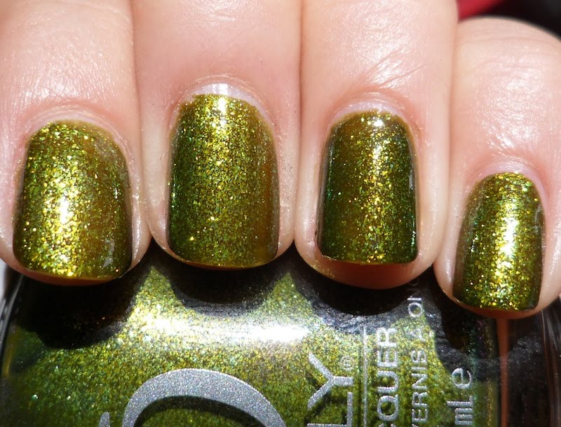
Bright lime-seafoam-gold dense shimmer in a murky swampy base. I'm trying to remember what the connection between Orly and SpaRitual -- I think they belong to the same parent company? -- and by now, most of us are not too surprised anymore when some Orly colors become SpaRitual colors and some SpaRitual colors become Orly colors. It's all good though: this is a fabulous color! The formula does seem to be slightly different... or maybe it's the brush? For some reason, I thought Optical Illusion went on a bit more sheerly but built up fast while It's Not Rocket Science was a bit more pigmented but didn't build up as quickly. Oddly, it didn't look different on the nail but in the photos, it does seem like Optical Illusion is just the slightest bit darker. Four coats to opacity for both. (Optical Illusion is on the second finger from the right.)

I don't have any more time to swatch the other three today but hopefully, I'll get around to it tomorrow or Friday. :D


Saturday, May 8, 2010

SpaRitual Optical Illusion NOTD (Spring/Summer 2010)

Though I have recently (well, six months ago) started buying high end polishes, I still consider $10 SpaRituals to be a bit much.

This one though? Worth. every. penny.

SpaRitual Optical Illusion


Definitely one of my favorite NOTDs of late. Who knew a swampy color could be so sparkly? Because that's what it is: a swamp monster-colored jelly with green-gold duochrome-y microflakies (really don't know what else to call 'em). It never looks like a straight up swamp monster mani because the microflakies give off a bright green shimmer at all times, which makes it look like a mossy green. But when the sun hits it, oh man, first of all, the base color is really obvious and the gold and green sparkle is so bright and lovely. It's ugly and gorgeous at the same time. (Well, I think it's gorgeous all the time because I like swamp monster-colored manis.)

Close up of Optical Illusion


Wednesday, March 24, 2010

Orange you glad I don't make puns more often? Entity Orange Pearl and SpaRitual Reverie

Sometimes, when I'm most frustrated with my research, I like to remember a former labmate of mine who is a post-doc in a visual working memory lab I worked in. I saw him at Psychonomics back in November: he had a poster on a new optical illusion that no one had documented yet. He walked me through the poster, as professional as you please, and when I asked how he had thought of it, he said it was all because of an accident! He was programming something else to test and he kept on seeing this weird resulting image on the screen; it drove him nuts because he thought there was something wrong with his programming! Eventually, he realized that he was... well, seeing things. Like the way we see a very clear triangle delineated in the following well-known illusion:
So he started asking questions on it, testing people on it, and was, at the time of the conference, in the process of writing up a paper for publication. I thought this was amazing and said to him, "You mean, you DISCOVERED a new optical illusion that NO ONE has ever studied before?"

He broke into this huge kid-like grin: "Yeah!"

It's hard to explain what was so touching about that moment and why it's such a sustaining memory for me (without getting too sentimental about the often excruciating process of academic research). But it makes me think of the last Calvin & Hobbes comic (click to enlarge):


"It's a magical world... let's go exploring!"

Yes, I had nail polish swatches for you today, too... :)

SpaRitual Reverie
"Radiant" is the word that comes to mind when I look at this polish. Also, "brushstroke-y". I thought this an amazingly pretty golden tangerine shimmer but between the hard-to-control formula and the brushstrokes, I feel pretty "meh" about this one.

Entity Orange Pearl

A lot less radiant but a little more workable. The application on this Entity polish was very good and easy: I used three coats here but could've done fine with two. It's not a mindblowing color or anything, a simple orange shimmer. Still, it was my NOTD for a couple of days and it held up very well.


Wednesday, August 26, 2009

The NOTD that I couldn't let go of (and I'm not sure why): China Glaze Agent Lavender

Today's NOTD was pretty much my NOT-Entire-D because I was too lazy to change it, even when I got really bored of it (repeatedly). I did a whole lot of swatching yesterday so I think I didn't want to deal with the whole polish-on/polish-off/polish-on-again rigmarole.

Even the application of China Glaze Agent Lavender was lazy: two coats, when I usually do three. And this one NEEDED three coats: it wasn't ugly VNL but it was VNL nonetheless. It was a little sticky in application but not streaky, since it did apply very evenly in two coats. It's just a shade more blue than lavender, IMO, but definitely more on the purple side compared to a somewhat similar shade, BB Couture Zuma Wave Rider (much bluer and more saturated, even though it is quite a light blue itself). It's a delicate color but it pops against my tanned skin, as evidenced by random people commenting on it today.

China Glaze Agent Lavender, pre-boredom:

About 12 hours into wearing Agent Lavender (6 of those were spent asleep), I felt the need to jazz it up with some sparkle so I put SpaRitual Shower the People (fine purple glitter topcoat suspended in sheer beige): very pretty but so subtle, it doesn't show up in photos.

Feeling dissatisfied 2 hours later, I decided to use some That's It? Instant Nail Art rub-on decals that I got from EZNails.com (they often, but not regularly, have them on sale for $1 each).

China Glaze Agent Lavender with That's It? Instant Nail Art in Black Daisies
I thought these decals would be less of a pain in the ass than they turned out to be. It's hard to hold a piece of stiff, flat vellum-type paper on a curved nail while simultaneously trying to rub the design on: it moves very easily and designs are easily transplanted in places besides those which you intended. But they are also easy to remove if you mess up: just scratch them off (obviously, this has to be done on dried nail polish).

Because I didn't use topcoat with these designs, they ended up getting wet an hour or two after I finished... essentially, melting the decals. That's fine, I thought they were kinda uninspired anyway... so instead of doing a new mani, I put on YET ANOTHER LAYER OF POLISH.

China Glaze Agent Lavender with Nfu.oh #50
I'm still trying to figure out what looks best with this delicate flakie polish. This isn't it. It's pretty... but it's also pretty boring. After this, I gave up -- though I did consider Konading but that would've been carrying the lazy too far (and would have defeated the whole purpose of being lazy, to boot) -- and I redid my nails in a light yellow franken that I couldn't take pictures of because by the time I got to redoing my nails, it was night (and I don't like photographing manis in sub-par light).

Voila, one polish (plus two as topcoats) and four different looks. That is how restless I was with my polish today, as well as how lazy I was. :)

Psst: don't forget to enter yourself in the BB Couture For Men Giveaway. Fill out the form in the sidebar (upper right of the webpage) to enter!


Saturday, August 15, 2009

BB Couture for Men swatches and BB Couture Sale!

An utterly fabulous sale is going on right now (as D has already noted but I want this to be at the top of the page for awhile)! For those on the Overall Beauty mailing list, BB Coutures are Buy 2 Get 1 FREE at OverallBeauty.com! No coupon/promo code required, but this sale expires tonight (11:59PM, August 15th, 2009). Minimum 4 free bottles and free shipping with purchases of $60+! Also, if you purchase 6 bottles, you can choose between a free BB Couture topcoat or basecoat!

For those who snoozed on joining the Overall Beauty mailing list, you have definitely lost out... but not totally, because starting at 12:01AM August 16th, non-mailing list folks can get BB Coutures at Buy 3 Get 1 FREE. Again, no promo/coupon code required, free shipping with purchases of $60+ and a limit of "only" 3 free polishes. The non-mailing list sale ends at 11:59PM August 16th, 2009.

Also, if you mention us, the Publish or Perish blog, in the comments section when you order on the 16th, non-newsletter folks have their maximum free polish limit bumped up to 4!! :D (So if you lost by snoozing, you still get a little extra by following this blog. ;))

Now, the important stuff... swatches of the brand new line of BB Couture for Men polishes!
Thanks to Kim at Overall Beauty, I got to test run these polishes a few days early and they, like, all the other BB Coutures I've tried, are some of the most tractable polishes I've ever used: they go where you want them to go. They don't go elsewhere on the nail. You put your brush down, that's where the polish lands! Amazing! :D

It's a somewhat limited color range: three grey/silver-like colors (though not really, and I'll get more into that in a moment), a dark blue and a dark green. At first, I was disappointed in the fact that it seemed so monochromatic but after swatching them, I'm convinced that it's actually a very beautiful, subtle collection of shimmer and metallic colors.

Here are some swatches on me. I hope that I'll get some swatches of these on my SO up in the coming weeks. :)

BB Couture For Men Grenade
Dark olive grey, chock full of gold shimmer. This one was my pre-emptive favorite: I love green! And it's a gorgeous color, a deeper, richer green than OPI At Your Quebec and Call, and far more glossy, shimmering and multidimensional than Quirius Cresskill Eve. It's a very elegant, dignified shade even if it's not a traditional polish color (or marketed for women). Two coats was enough for pure perfection. But it wasn't my favorite, suprisingly enough! Not even my second favorite.

BB Couture For Men 45 Caliber
Not quite gunmetal grey, as I would imagine a gun-named color would be (or maybe 45 Calibers look like this? I wouldn't know since I don't know anything about guns). Instead, it's a light metallic silver that does retain evidence of brushstrokes (but unlike others, I actually kind of like the look of brushstrokes). I was "eh" on this one, mostly because I'm picky with my silvers. Still, this was opaque in two coats and very easy to apply.

BB Couture For Men Blue Steel
My absolute favorite from the collex. The name suggests a blue sheen to it -- and this photo is misleading because it was taken in early morning light which gives it an orange tinge -- but to me, this was the color of oiled, oxidized steel. It's a metallic black that has a silver sheen and is SO beyond gorgeous. Because it's so glossy and metallic, it catches the other colors that surround it in photos and reflects them. It was so hard for me to get a good pic of this one! I'll do an NOTD of it and try to get more pics of it someday. An incredibly sexy color.

BB Couture For Men Blue Steel with Essie Matte About You topcoat
Unlike ManGlaze The Death Tar, which has a lot of silver shimmer in its black matte, when Blue Steel is mattefied, it still reflects silver but it's not a silver shimmer nor the speckled look that mattefied shimmer polishes have. It looks like brushed black metal (which is something that I enjoy in furniture and, apparently, on nails).

BB Couture for Men Widow Maker
There's something really f'ing creepy about the name of this polish, what it's named after and the sentiment it represents, but this polish is a real beauty. When I saw it first next to 45 Caliber, I was like, "Man, why are there two boring silvers in here?" But when I put them on, it was obvious that they were VERY different. While 45 Caliber was a metallic silver, this is more of a taupe with silver microshimmer. It reminded me a lot of Orly Pixie Dust in its finish and luminance. I find it to be an understated, sophisticated color. Second favorite of the collection, officially nudging Grenade into the number three place. Sorry, Grenade.

BB Couture 45 Caliber on middle and pinky fingers
BB Couture Widow Maker on index and ring fingers

Again, my amateur photo skills diminish what it actually looks like in person but a side-by-side comparison might help people see why I actually think of these as very different polishes. I don't capture the difference in color here too well but the finishes are very distinct.

And last but not least...
BB Couture for Men Military Blues

A deep metallic blue. This was the smoothest polish in this collection, which is saying something. Very minimal brushstroking once the polish settles. It's such a rich, vibrant shade. I'm not at all a fan of metallic blues -- all other blues, yes; metallic blue, no -- but I liked this one a lot. I don't think it's anything incredibly special but it is a color that catches the eye. I should've done a matte tc with this one, too...! Oh well. :)

Obviously, this is a great collection for women but for any men out there who are curious about polish, this is a great way to get into it: the application is very easy (since most guys do have a lot less practice in polish application than many women) and these colors are stunning with very little effort. No glossy topcoat was used for any of these and yet they look highly shined and fine without. They are definitely "masculine" colors but if you need matte to be manly, that's nothing a little Essie Matte About You or Nubar V for Men won't cure!

As a feminist, I'm really overjoyed that it has become more widely acceptable for men to wear nail polish (check out a fabulous new blog by ybpolishboy!), even though people still seem to need to "butch it up" for the guys.

Women are still both professionally and socially penalized for not following typical gender roles... but what's nice is that some women are at least aware of this fact. Men are generally left in the dark, it seems, about the fact that they really aren't "allowed" to do things that women do. For instance, the facetious but insensible observation remains that women can wear pants but men can't wear skirts. Why not? And my facetious but sensible reaction remains: umm... isn't it better for men to wear skirts? True, really tight pants are no longer in style -- thank heavens -- but I imagine a little more freedom of *ahem* movement is not a bad thing for *ahem* the guys.

ANYWAY. Back to the new BB Couture Line. The only other polish line I know that is marketed as "for men" is the ManGlaze pair of matte polishes. That black and grey pair are called The Death Tar and Fuggen Ugly. Butch enough for you?

While the normal BB Couture line has a little paragraph on the bottle about how it's a basecoat, topcoat, nail color, nail strengthener in one, the squat square 0.5fl oz bottles (slightly smaller than the normal 0.6fl oz bottles) state simply:

SPECIALLY FORMULATED
JUST FOR MEN
With added natural strengtheners

Reminds me of a pair of nail clippers that I saw in a Sky Mall catalogue that was advertised as manly titanium nail shears, guaranteed to cut through even the toughest, manliest nail. ...I just keep telling myself that progress is gradual. Though I don't think I'll live to see the day that a pink nail polish will be found in "men's nail polish"...!

Before I wrap up, just a word to the shopping wise (or not, because without sales, I would have a lot more money in my bank account): SIGN UP FOR NEWSLETTERS. If you must, create a separate email account just for newsletters. You will catch so many more sales that way. :D Or you can continue to read this blog, because I'm trying to pass on every sale that comes my way.

(Reminds me, AveYou, a good source for SpaRitual polishes, is also having a 10% entire purchase sale with the code AYPSS10. Expires August 22nd, 2009.)


Sunday, July 26, 2009

Intro to Jess

Hello! My name is Jess (daydream222@MUA) and I am so excited to be part of this blog. I graduated from undergrad in 2008 and proceeded to take a year and a half off between undergrad and grad school. Now I am going back to school beginning in August for my Masters in Women's and Gender Studies. Yes, I am a feminist. No, I am not a stereotypical feminist. Sometimes it is difficult to be a feminist when so many other feminists (note: not ALL feminists) look down upon women loving things like fashion and makeup. The important distinction here is that I wear nail polish because I love color and because polish makes me feel pretty. I wear it for myself and no one else, and I am grateful that I can freely choose what colors I want to wear without anyone telling me what I should wear.

I think that is enough ranting for today. I will gladly take any questions about this subject! Now, onto the pictures....

My typical nail routine involves swiping my nails with Zoya Remove+ followed by Nubar Nu Nails basecoat, 2-3 coats of polish, and Nubar Diamont topcoat. All of the pictures below follow this routine.

Click on each pic to see it larger!

First up is Sephora by OPI Skinny Jeans. This is 2 coats. This picture was after 2 days of wear! SOPIs wear like iron on me.

Second we have Sephora by OPI IM Beauty. Like all yellows, this one was streaky. It only took 3 coats to even out though and the end result was very pretty. Coworkers told me it "just wasn't pretty," though I heartily disagree. This NOTD was SpaRitual Solitude on every nail but my middle nail, which I painted Precision U Rock & I Roll. Both colors are 2 coats. I love doing manis with contrasting fingers like this.

Last but definitely not least is my most recent and current NOTD, Orly Enchanted Forest. This color is to die for!!! This is only 2 coats (though I probably could have only used one). It is a beautiful blue-based green that works very well with my cooler skin tone.

And that is all for today! Thank you for looking! :)

Related Posts with Thumbnails