Showing posts with label Lippmann. Show all posts

Monday, September 3, 2012

Lippmann Waking Up in Vegas


This was sent to me by a very kind POP reader who didn't wear it. I always dig these kinds of colours so I was so delighted to be able to try this - Lippmanns are crazy expensive here (about £15) and I am not disappointed, the quality on this is great. I think this was one coat! A real superstar polish for me - this will be tucked in my bag for conferences every time. It also matches one of my favourite suits.

I wore this for luck to a job interview back in June as a part-time lecturer while I finish my PhD. Today is my first day :)

Sunday, March 4, 2012

The kindness of strangers: Lippmann naked

I had something else scheduled to show you for today (a 'here's one I made earlier' I took last month) but I had a lovely package arrive a couple of days ago and I wanted to show you right away.

On a post a few weeks back I mentioned a hunch that I thought a colour might be similar to Lippmann's Waking up in Vegas, a colour I had long admired from afar. A very kind reader offered to send me her bottle, since it wasn't a colour she wore. It turned out when I got the package that she sent quite a few other colours besides! So, thank you again Elaine, I can't wait to swatch them! :) MUA has made me a great believer in doing nice things for people you don't know, and this really touched me and lifted me during a slightly bleak patch last month, so it was a much appreciated gesture.

Anyway, this is the first I tried: Lippmann naked. I had a hunch from online swatches that this might be a good mannequin hands colour for me (I wear NC15 usually) and it definitely is. It reminds me a little of Mavala Liberty, which I wore for my PhD upgrade), but the Lipmmann is much easier to apply and doesn't have the eternal dry time of the Mavala.


This is three coats. As you can see it's a semi-sheer shade, so there's still a little bit of VNL. I really like this actually, I think it gives the polish more depth than if it was fully opaque. It also applies smoothly considering that this kind of formula should be rife with problems, and is nice and shiny without a topcoat. I really like it, this is definitely the kind of shade I pack for conferences, holidays and the like, because chips don't show.

Friday, January 20, 2012

Deborah Lippmann Forget You and Candy Shop (Get This Party Started, Fall 2011)

I don't understand at all why my SO didn't like these polishes. He's loved most of the other Lippmann chunky glitters I've worn. (He's even worn a couple himself!)

Deborah Lippmann Forget You

Basically, Lippmann Happy Birthday in black jelly. The above is three coats. And man, did it shrink a lot and fast. :( It's awesome because it's a version of Happy Birthday but on the whole, not super interesting. 


Deborah Lippmann Candy Shop

I always want to write this as "Candy Shoppe" (as in "Ye Olde"). I don't know why. This one I loved for some odd reason: me and pinks don't get along. I think I would've liked the barbie pink base just a little bit more jelly but as it is, the bright Happy Birthday glitter gets shifted down just a tiny notch, which gives the glitter a bit of a matte appearance. Three coats. Shrinkage city. 


Sunday, December 25, 2011

Deborah Lippmann I Know What Boys Like (and with Claire's Mystical)

Deborah Lippmann I Know What Boys Like
Loved this blurple (more blue than purple, though) creme. Though it looks like it has gold shimmer in the photo... but then, wouldn't this be a great color with gold shimmer? Three coats, applied beautifully. Lippmann cremes have usually been somewhat hit or miss for me -- I usually prefer to buy her glitters -- but this one went on well.


Claire's Mystical over Deborah Lippmann I Know What Boys Like
It's such a pity that this blue/purple glitter mixture from Claire's gets nowhere near opaque. So I slapped it on top of I Know What Boys Like a few days later. Eh. I liked it plain better... and it's a strange day when I prefer a non-glittery mani to a glitter mani. 


Friday, November 25, 2011

"You Love It!" - Deborah Lippmann Across the Universe

Recently I had the pleasure of staying with the lovely Piff in NYC! It was an amazing time, and she is a kickass friend. Seriously. BUT...

...she did make me wear some polishes I would...*ahem*...not normally wear. You will see the worst of those atrocities from her soon - she really enjoyed seeing me suffer - but she made me promise to wear one polish as my NOTD. Out of the choices she went pretty easy on me, I have to say! This is Deborah Lippmann's Across the Universe...


Way less obnoxious on the nail than I thought it would be for such a chunky glitter. I was skeptical (very) but after I put it on, Piff kept informing me "You love it. I see it in your face. You love it." Maybe she got to me? I did feel a little foolish prancing around JFK and going into work the next day with my glitter mani, but I have to say - in the quiet moments when I was alone and not in public, I really liked looking at it. What I like about it is the depth of the base colour so the glitter isn't all -BAM!- at the surface. It's a little more mysterious than that....it reminds me of a mermaid.

Has anyone pushed you out of your polish comfort zone? Did you love/like/hate it?

kittytokaren


Friday, April 8, 2011

China Glaze Starboard layered with Lippmann Boom Boom Pow!

Lippmann Boom Boom Pow layered over China Glaze Starboard


I wish I could have properly captured this manicure. It really doesn't look like just haphazard pieces of glitter in shimmery gold (but very sheer) base. It gave it a really lovely and somewhat unusual look; from arm's length, it looked as if I had put on very fine gold leaf over Starboard.


Friday, March 18, 2011

More Lippmann: Waking Up in Vegas

This one was surprising. Wasn't expecting much from this light taupe-y putty color but it ended up applying very well.

Lippmann Waking Up in Vegas
As usual, my skintone somehow makes this polish look different on my nails than others. It leans a bit purple on me. I was expecting more of a yellow-ish tinged taupe but I like it much better on me like this. Two coats, applied beautifully (though I did shake the heck out of it beforehand).

This week has just flown by. I spent about seven hours straight cleaning yesterday. Yay for Diamont. I was able to do my nails in between two bathrooms and my mani was fine after twenty minutes dry time. (And I was scrubbing the hell out of the tub.) :)


Wednesday, March 16, 2011

An old Lippmann: Call Me Irresponsible

Hmm... didn't get as much done on my blog to-do list as I wanted to yesterday. But today's another day.

I also wish it weren't so overcast outside: it's no fun to be restricted to using my lightbox. :(

Lippmann Call Me Irresponsible
Can't decide whether I like this one or not. It's very jelly. Three coats. Goes on pretty well. But I love the bottle color and the jelly-ness of the polish lightens it to the sort of reddish purple that I'm not the biggest fan of. Meh. I waited a long time to get this and now that I have it... I don't know if I regret spending the money or not.


Tuesday, March 15, 2011

Lippmann Glitter in the Air over Avon White French Tip

It has such promise in the bottle:


I don't know what's worse in the photo: my cuticles or the polish (either of them).

Lippmann Glitter in the Air over Avon White French Tip
First, the white avon: three coats, still not opaque. Grr. Second, GiTA: if I had a LOT of patience and the perfect milky blue, this would be beautiful. As it is... this was a terrible mani.

Today is going to be a "catch-up-on-blog-stuff" day. I'm going to finally have time to respond to comments. Finally going to have time to swatch. Finally going to put the Inque contest results up for a vote (probably to be posted tomorrow). My spring break hasn't technically started but the majority of the work I've had to do for the quarter is complete. It has been a REALLY rough quarter and I'm so grateful that it is nearly over.

(Also: Misa sent me their two spring collections and China Glaze sent me some Crackles... but not the pretty purple or turquoise ones! That's alright though: I went ahead and bought them off of Amazon...)


Saturday, January 1, 2011

Happy New Year! Milani Gems and Lippmann Happy Birthday comparison

Happy New Year! :D 2011 already. Can't believe it. Years seriously do go faster the older you get. Nothing TOO exciting this year coming up for me: a bunch of weddings (none of them mine), a lot of travel... I am starting out the new year on another continent right now, after all. I'm boarding a flight back to the US in a few hours. It's going to be about a 15 hour flight. And, amazingly, it'll still be 1/1/11 when I land even though I'm leaving Taipei at about 7:30pm local time on 1/1/11. And I'm scheduled to arrive at 2:30pm local time in the US. This is going to be the longest New Year's Day I've ever lived... and to, you know, celebrate that, here's a particularly festive, confetti-like polish:

Milani Jewel FX Gem
I had been out of the nail polish loop for about a month when this came out. I wasn't checking blogs, I wasn't on MUA, wasn't paying much attention to anything besides my work. But when I saw this on a blog, I FLIPPED OUT. Lippmann Happy Birthday is one of my favorite polishes ever and though I'm not willing to plunk down more money for a backup, I was going to run out and buy whatever dupe I could find. So I ran out to buy this... and didn't find it. And then ordered it from the Milani website. And paid shipping. Because I needed it.

So the big question is: how similar are they? Short answer: they feel the same, but they aren't the same.

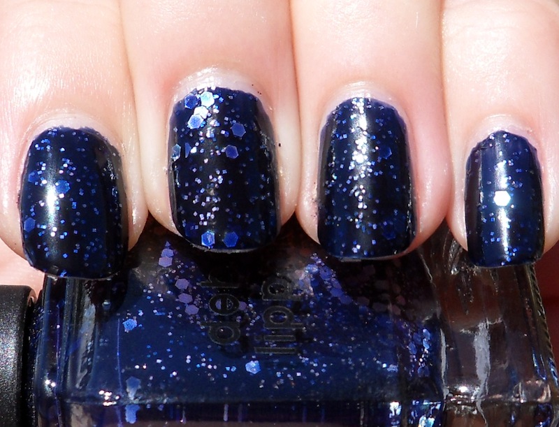
Lippmann Happy Birthday and Milani Gems comparison
From left to right:
Index - HB, three coats
Middle - HB, two coats
Ring - Gems, three coats
Pinky - Gems, two coats


The first thing I noticed was that Milani Gems seems to have slightly more glitter in it so it's easier to get more of it on the nail with fewer coats. In my mind, this makes the Milani preferable to the Lippmann. But, imo, the mix of glitter is more interesting in the Lippmann. A closeup is better at showing the differences between the two at three coats each (sorry for the blurry one of Happy Birthday).
Milani Gems closeup


Lippmann Happy Birthday closeup
Color-wise, they use about the same smattering of shades: the Lippmann has silver, gold, dark blue, green, red and purple. The Milani is pretty much the same except the blue is a lighter blue. The big difference is in the shape of the glitter: all of the glitter in the Milani is hexagonal, though there are two different sizes. While the Lippmann also sports two sizes of glitter, only the large glitter is hexagonal while the small glitter is square. IMO, square glitter is almost always more interesting to me than hexagonal because it is less common than hexagonal glitter in polishes. The mix of the two types is what makes the Lippmann sort of brilliant. Too bad it doesn't apply as well as the Milani. And too bad it's several times the price of the Milani!

Here's the thing: no one is going to look too closely at your nails and notice, "Hey, those are all hexagonal in shape!" or "Hey, it's a mix of squares and hexagons!" If you don't have the Lippmann (but want it), Milani Gems is totally worth it and few people will know the difference.

OK. Now to continue on the longest New Year's Day ever. At least I'm in business class (or rather, "premium economy") the way back.


Monday, November 15, 2010

Purple Jelly Comparison

Hi guys!  I have a small comparison for you today.  A reader asked how these two polishes compare when I posted my swatch picture of Deborah Lippmann Call Me Irresponsible so I figured I do a formal comparison.  I don't have a bottle comparison picture since the Milani is in an opaque bottle.  First up, I'll repost the swatch pictures of each.

I think this is four coats of Milani Rad Purple.


And here's a picture of four coats of Deborah Lippmann Call Me Irresponsible.


Now on to the comparison.  I've got Call Me Irresponsible on my index and ring nails.   Rad Purple is on my middle and pinkie finger nails.  I used four coats of each and this picture was taken in the sun.


This picture was taken inside by a window.  This one is the most color accurate of all my photos.  I think it's funny how the Deborah Lippmann comes closer to the Milani bottle than the Milani does.


And this picture was taken with the flash.  It's not very color accurate, but that's how it sometimes goes with purples.


Rad Purple is brighter and redder than Call Me Irresponsible (which is bluer). Rad Purple also dries to a satin finish so I put top coat on it. Call Me Irresponsible dries shiny.  Formula-wise, the Milani behaved better for me.  I had a heck of a time trying to get the Deborah Lippmann even, but the Milani wasn't so bad.  They are both jelly finishes.

It seemed like such a shame to just wipe these off after taking pictures so I tried out some layering.  I pulled out Pure Ice Heart Breaker and Nfu-Oh #51 and added on coat of Heart Breaker to my index and middle nails.  Then I put one coat of the Nfu-Oh on my ring and pinkie fingers.  Gah!  This was so gorgeous.  I'll have to do a full manicure of Call Me Irresponsible with the Nfu-Oh on top very soon.


I hope you enjoyed!

Wednesday, October 27, 2010

A Grey Comparison

It's comparison time again!  This time I thought I'd compare some of my grey polishes.  Here's the cast of characters:


I applied three coats of each in the same order as above, from thumb to pinkie.  I took this picture in the sun.


I took this picture in the shade.


And I took this picture with the flash.


I was hoping to find a dupe for Waking Up In Vegas, but I didn't.  What I actually found was that it's probably my least favorite of these polishes.  It just seems to not go as well with my skin tone, unfortunately.  Oh well, I still needed to have it for the name.  It seems like a lighter version of Recycle, but I prefer Recycle with my skin tone.

High Society and Vintage Gray are very similar in color, but Vintage Gray is lighter.  There's probably no reason to own both since they're quite similar, though if you like this type of color, then owning both might be a good thing for you since they aren't dupes.

Point Break and Recycle are the darkest greys in this comparison.  Point Break leans blue whereas Recycle seems to lean a bit green.

Friday, September 17, 2010

Lippmann Collection - Bad Romance

Lady Gaga, you may be one crazy whack-a-doo when it comes to clothing choices and footwear (sky-high platforms in an airport? sister, please) but as long as you keep belting out tunes that make me sing along and inspiring polishes like this one, well, you're okay in my book.


Lippmann Collection - Bad Romance

As all of you know by now, Bad Romance is one of the Fall 2010 Collection polishes released as a Lippmann Collection lacquer along with its flashy sister, Across the Universe. A dark black jelly that is injected with two sizes of magenta glitter, this puppy is a showstopper, but not in the same ways as ATU. For one, the pigment is definitely heavier so less coats are required, and the glitter is a little more understated. Much like ATU, however, this is one striking polish! If i could live my life with only these two polishes, well... I wouldn't be ECSTATIC, but I certainly wouldn't be unhappy.

And once again, the price... well, it didn't feel fabulous sliding my credit card across the cool glass of the Nordstrom display case towards the cashier, but when this polish wore for five days WITHOUT A CHIP, well, that felt fabulous.

As for you, Lady Gaga -

Don't look now, but your shoes are very high AND YOU ARE IN AN AIRPORT.

Happy day, all!

Monday, September 6, 2010

Some 'edgy neutral' misfires!

I've shown you so many polishes that fall in the 'edgy neutral' category that I adore, I thought it was time to show you some I didn't love, just to even the score. Sometimes not all polishes work - even if they look great in the bottle! Here are a couple that I was excited about, but didn't work out as planned, for different reasons.

$OPI Under My Trench Coat:

I have two Sephora by OPI neutrals that I absolutely love - Metro Chic and Run With It! - and I have been itching to give their sister - Under My Trench Coat - a spin!


This polish reminds me of the clay in art class when I was a kid - complete with shimmer that looks like the little grains in the clay! As pleasant as those memories are, I'm not sure I'm loving carrying that memory around on my nails - it certainly doesn't suit me at all. Even though it is fairly unique in my collection of 'edgy neutrals' thanks to its shimmer, it's not working. All this polish does is bring out the strong yellow tones in my skin, making me look...jaundiced. Nice. Disappointing because I loved it in the bottle!

Off to a new home it goes! I'm sure this would look good on someone with different colouring. :)


Lippmann Waking Up In Vegas:


When I saw this in the bottle, I went completely Gaga for it! (Haha I'm so punny!) It looked like the perfect warmer grey, that doesn't have the green leanings of Essie Chinchilly. Unlike Under My Trench, I actually really like the colour on my nails, and I think it suits me. BUT, the application on this was *horrendous*. Super chalky, and I had to be really careful to load my brush up and use very few strokes, otherwise I'd get uneven bumpiness in the finish that is normally characteristic of pastels. Oh, and I got chips after a day. For such expensive polish, this is ridiculous, and I just don't look forward to wearing it because of the application and wear issues. Away it goes!

So that's all for today! Have you ever bought a polish because of how it looked in the bottle only to be disappointed later?

kittytokaren


Sunday, August 1, 2010

Words are flowing out like endless rain into a paper cup...

Sick of this polish yet? It's been on everybody's blog, it seems. Oh well... here it is again! :)

Lippmann Across the Universe

Four coats of jelly, glittery, hexy, sexy goodness! As far as I can tell, it's blue and green hex glitter and blue glitter in a dark blue jelly. Yes, it was four coats but it's so worth it for the effect. I found this pretty easy to apply and I wasn't even paying that much attention to the placement of the hex glitters: they slid on and settled and were perfect. :)

Close up of Across the Universe
Isn't it beeauuutyful? I prefer this one so much more than Bad Romance (and Ruby Red Slippers).

Also, the Polish or Perish Anniversary Giveaway closed last night. The winner has been chosen at random using ContestMachine's random-winner-choosing mechanism:

CONGRATULATIONS DELAYNEE!!

The email I sent her had the very generic title "CONGRATULATIONS!!" and apparently, she almost just deleted it because she thought it was spam. I'm glad you read it, Delaynee! ;)

Also, Delaynee is also a nail blogger and you guys should check her out here: Dees Polish Endeavours.

Thank you all for participating! We had 873 entries in total over the last two weeks. We did not restrict our giveaway to Google Followers -- as many readers choose to keep up with blogs through different methods and might not like using Google Friends Connect -- but I am kind of amused at the thought that we might be the first nail blog whose giveaway entries exceed their number of Followers. ;)

Again, thanks to all of our readers for making this past year (and two weeks) so wonderful and worthwhile for all of us. I hope the coming year will be as fabulous!


Monday, July 19, 2010

Lippmann Bad Romance

I don't know how anyone could apply this polish without humming Lady Gaga's Bad Romance to themselves. Or maybe just belting it out outright. (Same with Across the Universe... I don't even have it yet and the song's stuck on repeat in my head every time I see a swatch of it.)

Lippmann Bad Romance

First off, let me say this: this polish -- like Ruby Red Slippers before it -- is a freakin' bitch and a half to remove. And as usual with hex+glitter polishes in a dark base, I kinda feel like I've covered my nails with some sort of weird pox-like disease. This isn't to say that I don't like the effect; I actually quite love this sort of polish. But it kind makes me shudder sometimes.

Damn, this is a weird and probably inadequte review so far.

Let's start again: Bad Romance is purple hex glitter and regular glitter suspended in a black jelly. It took two coats to be opaque -- pretty good for a jelly, even a dark one -- and lasted several days without chipping. I got shrinkage with Gelous bc and Diamont tc though, which looks terrible with really dark polishes. Removal was aggravating, as expected.

Better?

It's a purple version of Ruby Red Slippers, which I liked alright and I appreciated its uniqueness. I like the purple better than the red, so I like this one a bit more...

Okay, I'm done with writing today. I can't seem to construct a sentence that actually reflects what I'm thinking.


Thursday, July 15, 2010

Lippmann All That Jazz trio swatches

Just got these in from Nordstroms.com yesterday and swatched them immediately!

Lippmann Some Enchanted Evening (over Essie Demure Vixen)
Pink glitter with larger hex glitter suspended in clear polish. This can never be built up to be opaque... unless you had superhuman patience. The above shows two coats over Essie Demure Vixen. This is probably not a great layering combination but I had DV on right as I was beginning to swatch and decided to just go with it.

Lippmann Lady Sings the Blues

I thought this would be my favorite of the set but I was sort of disappointed by it. Silver glitter and large silver hex glitter suspended in dark blue jelly. In theory, I love it, but the silver hex glitter sticks up on the surface and looks more silver than blue on the top coat. I kind of wish it were blue glitter rather than silver glitter. It also wasn't as glossy as I would have liked. BUT! It was opaque in two coats (which is great for a jelly) and it dried ridiculously fast.

Lippmann Razzle Dazzle


I was not expecting this to be my favorite of the set but it absolutely was. It is just soooo deliciously rich and glittery: dark, purple-leaning red jelly (like the color of good sangria with a lot of fruit in it) with two different sizes of red glitter. Yummers! Also, had a lovely glossy finish. This was three coats but it should be fine at two.

Video of Razzle Dazzle


Don't forget to enter our anniversary giveaway: details in the previous post!


Related Posts with Thumbnails